Rebuilt Viking's fragmented digital ecosystem — merging the My Viking Journey website and Viking Voyager App into one seamless companion that 99% of users preferred over the original experience.
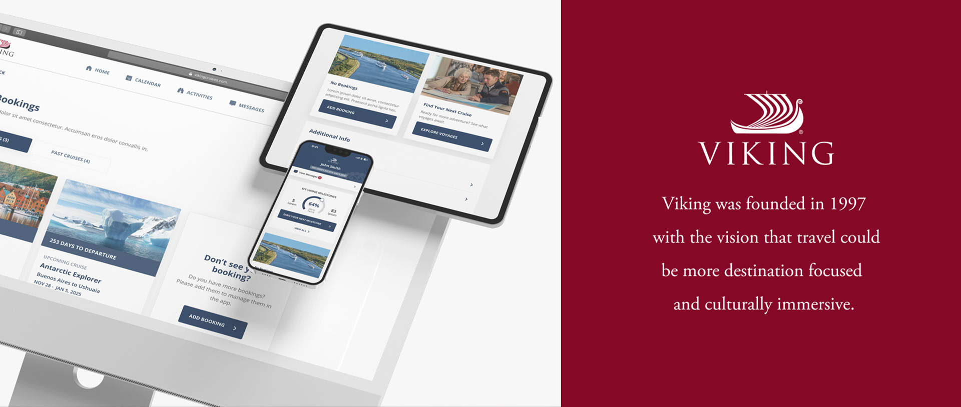
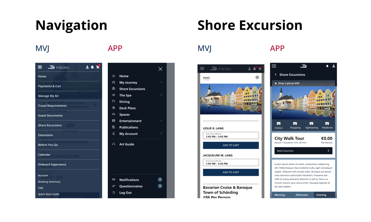
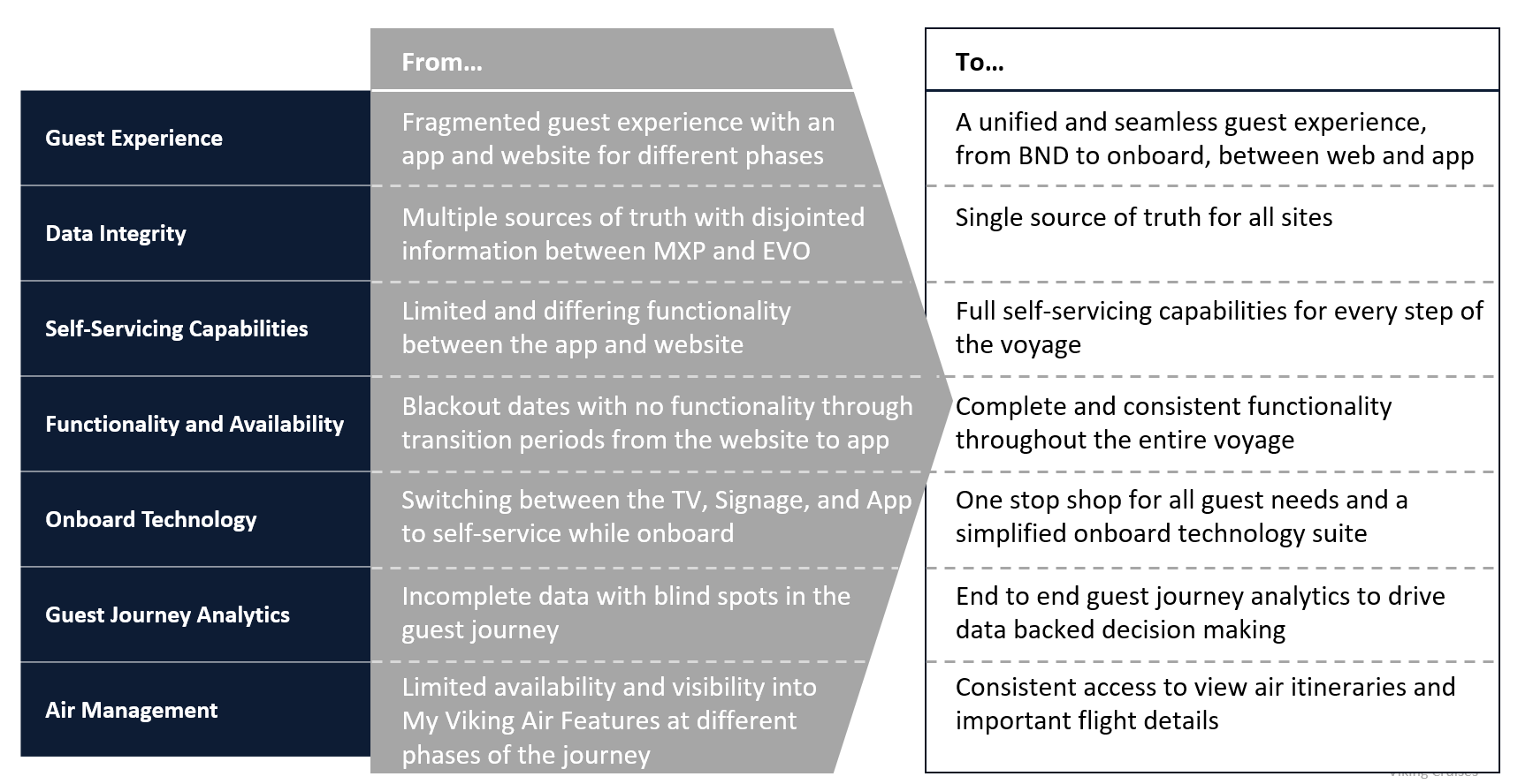
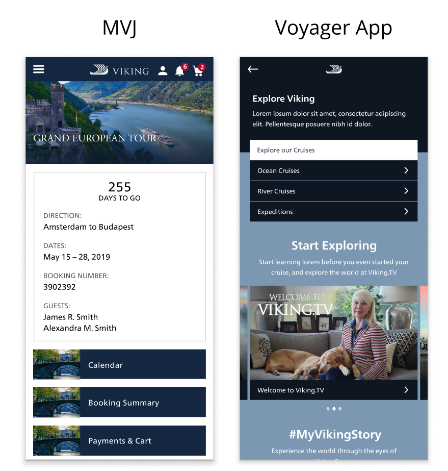
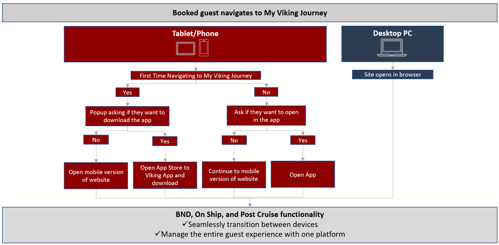
Viking guests had two digital products: My Viking Journey (MVJ) — a web experience for pre-cruise planning — and the Viking Voyager App — an onboard companion. Both offered overlapping features. Neither talked to the other. The visual identity was inconsistent. The login experience was duplicated. The result was guests defaulting to call centres instead of digital tools.
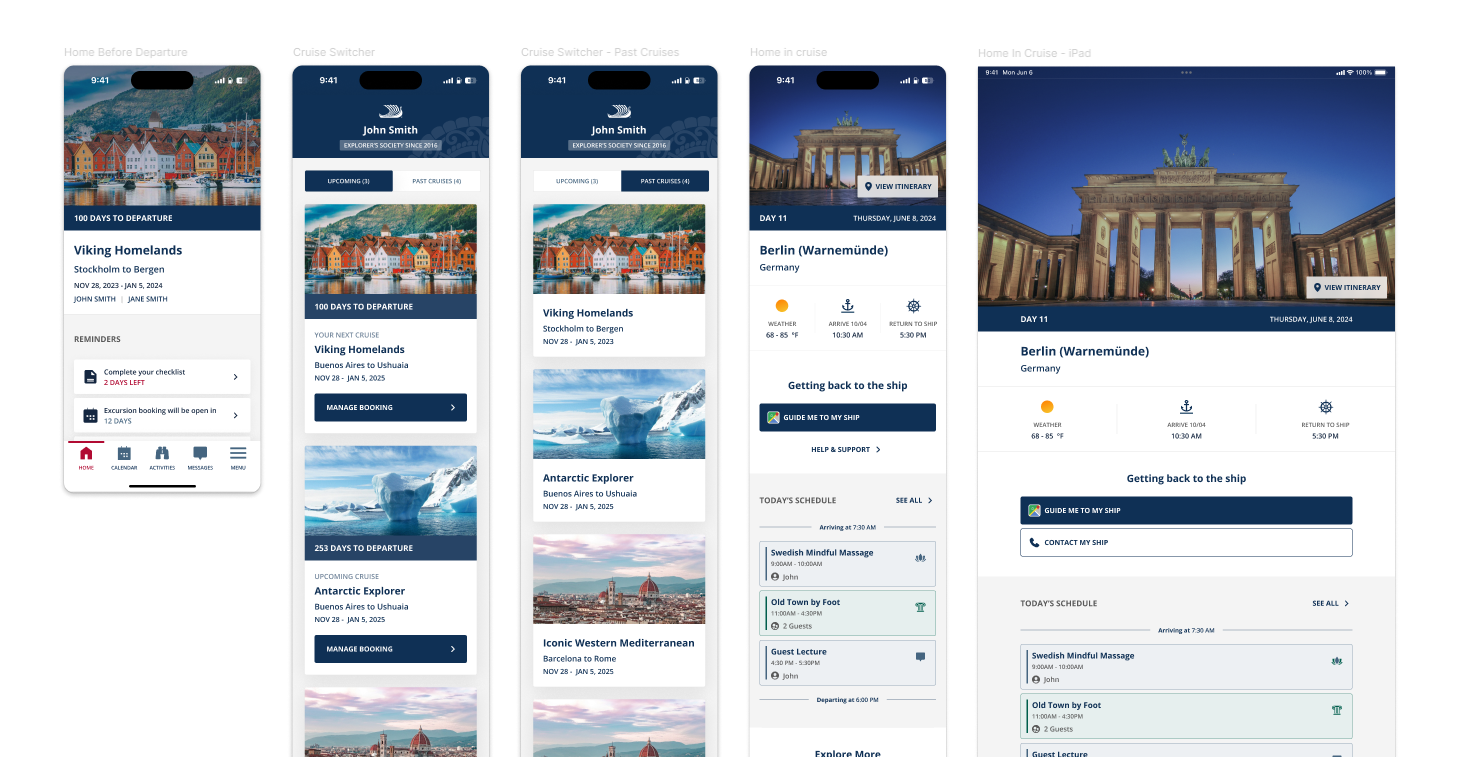
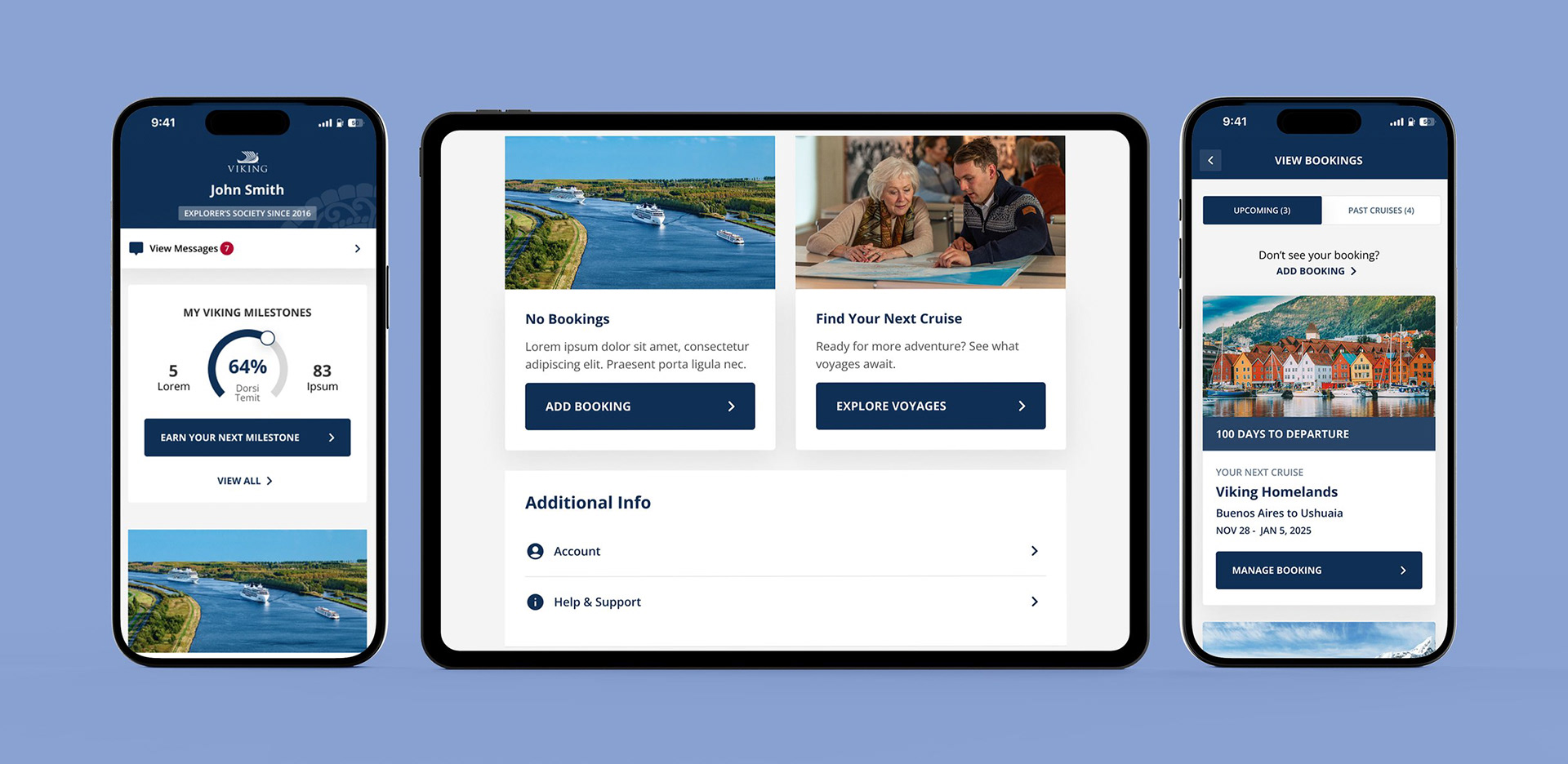
As UX Manager and Lead Designer, I led the end-to-end redesign that merged these two products into a single, unified mobile-first companion — covering the complete guest journey before, during, and after every cruise.
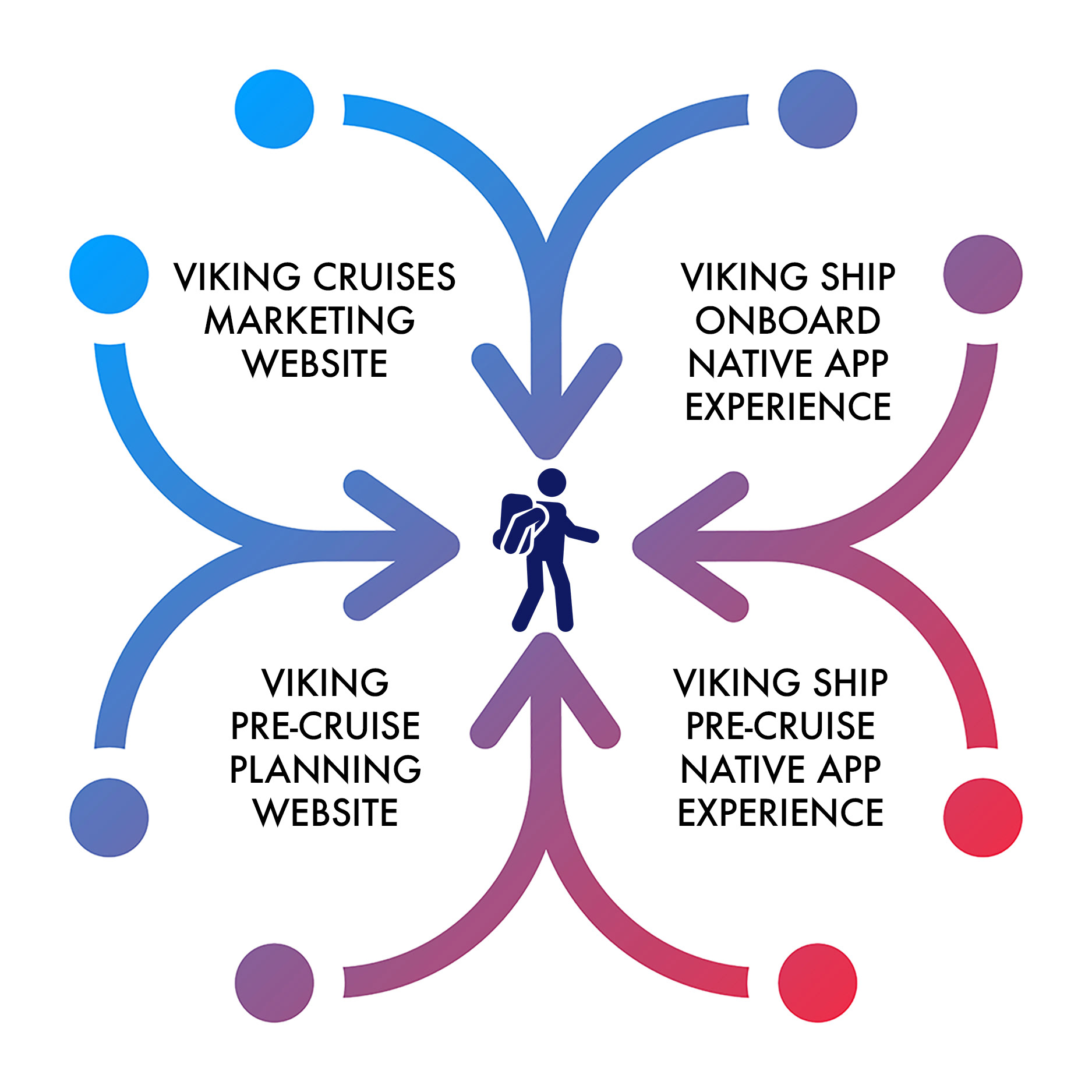
Build a mobile-first digital companion platform that empowers guests, unifies the Viking ecosystem, reduces support dependency, and gets smarter through data — covering every phase of the cruise journey.
The existing experience split the guest journey across two disconnected digital products — creating confusion, duplicated effort, and a support burden that should have been handled digitally.
MVJ and the App lacked cohesion — creating confusion during booking, in-transit, and post-trip phases when users needed continuity most.
The two products looked and felt like different brands — undermining trust in Viking's digital capability.
Guests relied on call centres and onboard staff because the digital experience wasn't good enough to trust.
Limited features, inconsistent performance, and zero offline capability — especially painful during at-sea blackout periods.
Tools for itinerary customisation, real-time travel updates, and self-service capabilities — reducing call centre dependency through design, not policy.
Seamless experience across all phases of the guest journey — including offline functionality for at-sea blackout periods where connectivity disappears.
Guests should be able to navigate their entire experience without asking for help — making the app the first choice, not the last resort.
Analytics, user surveys, and behavioural data to personalise experiences, improve functionality, and drive ongoing innovation post-launch.
Identified core pain points and established KPIs around search categories and user touch-points before any design began.
Structured information architecture to streamline navigation and reduce friction across the complete guest journey.
Collaborated with a design agency for the initial foundation, then took ownership of gamification, login, message centre, and next-cruise booking.
Feedback sessions with two user pools — past Viking guests and new-to-cruising users — validating against different expectations and mental models.
The design agency provided a strong hi-fi starting point — but I was responsible for conceptualising and designing the critical features that would make the difference between a good-looking app and one guests actually used: Gamification, Login & Account Creation, Message Centre, Next Cruise Booking, and several other key flows.
Feedback sessions and intercept surveys were conducted with both past guests and new-to-cruising users — establishing behavioural analytics that drove design decisions. The results were unambiguous.
Users preferred a single app over the disjointed MVJ + App experience — overwhelming preference for the unified approach.
Users engaged more with the redesigned app — improved usability, navigation, and retention across key flows.
Users navigated past the first screen — a direct measure of onboarding success and first-impression clarity.
Users rated the new experience a vast improvement over both original products — across all age groups and experience levels.