Product Detail Page · UX Redesign
Sourceability / Sourcengine™ · 2021–2022
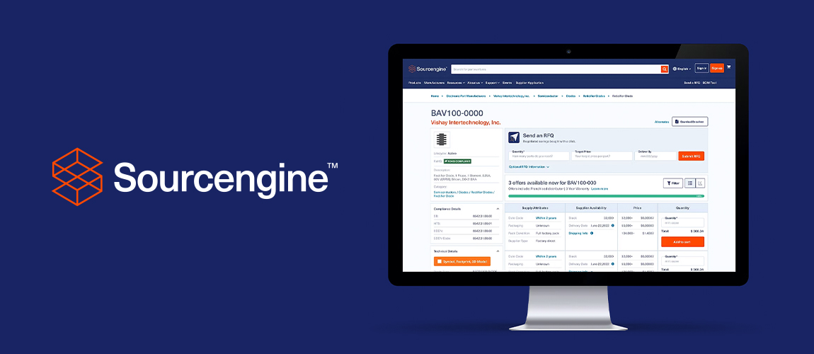
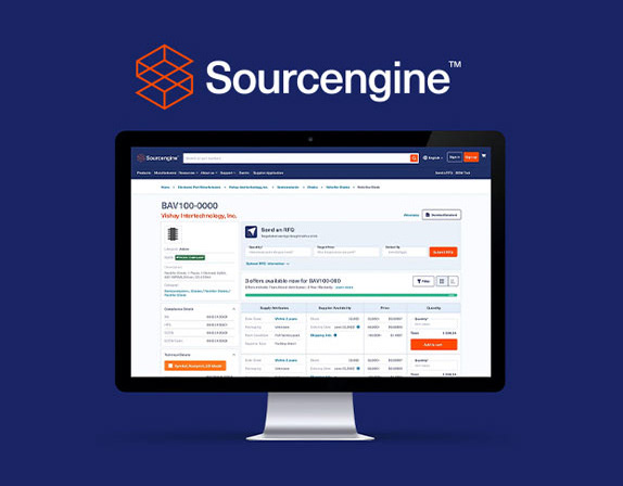
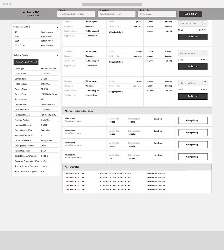
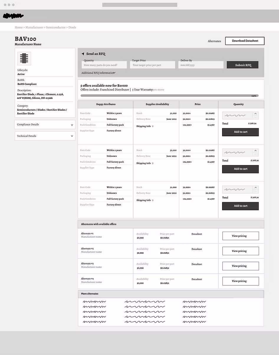
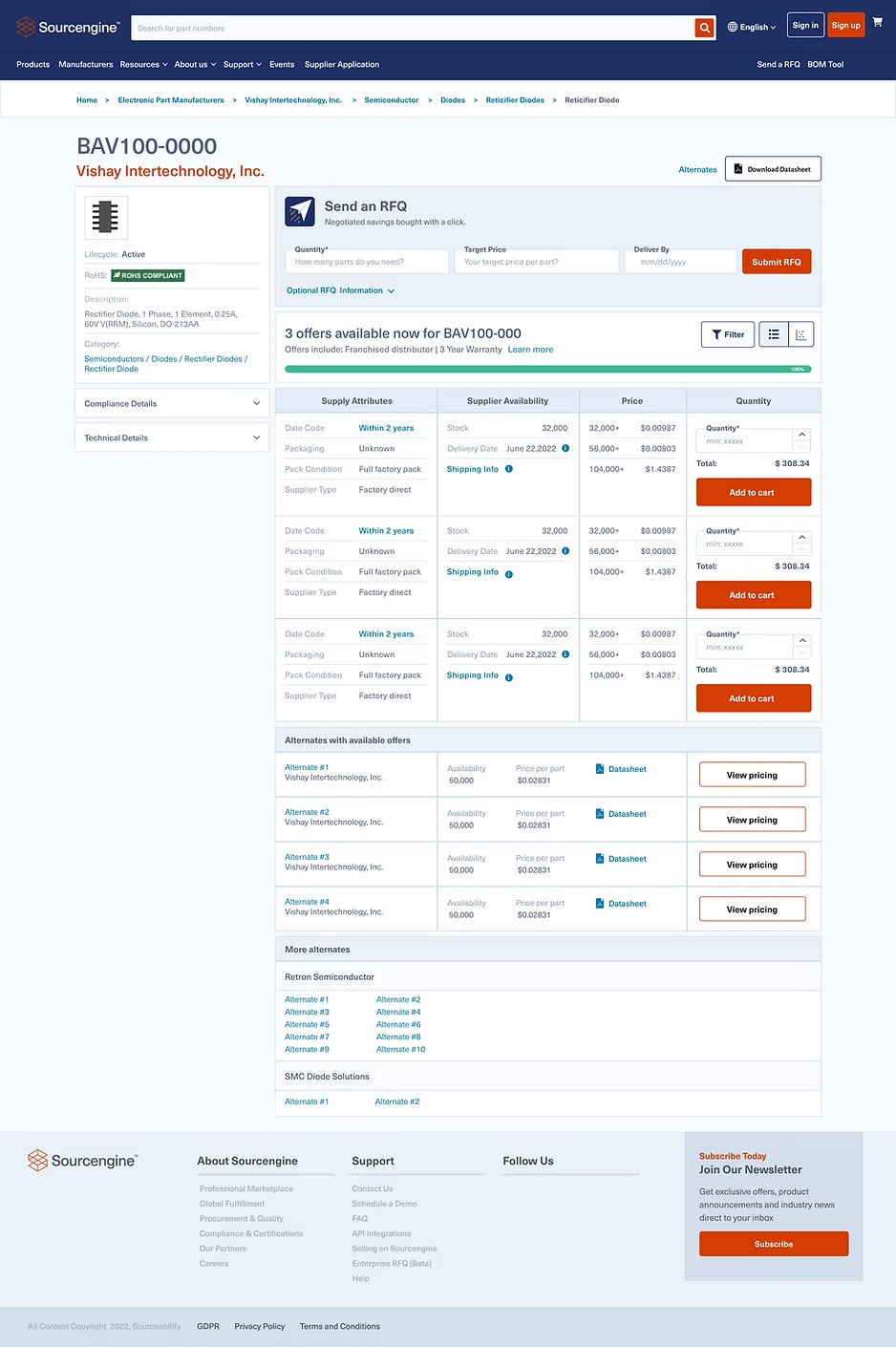
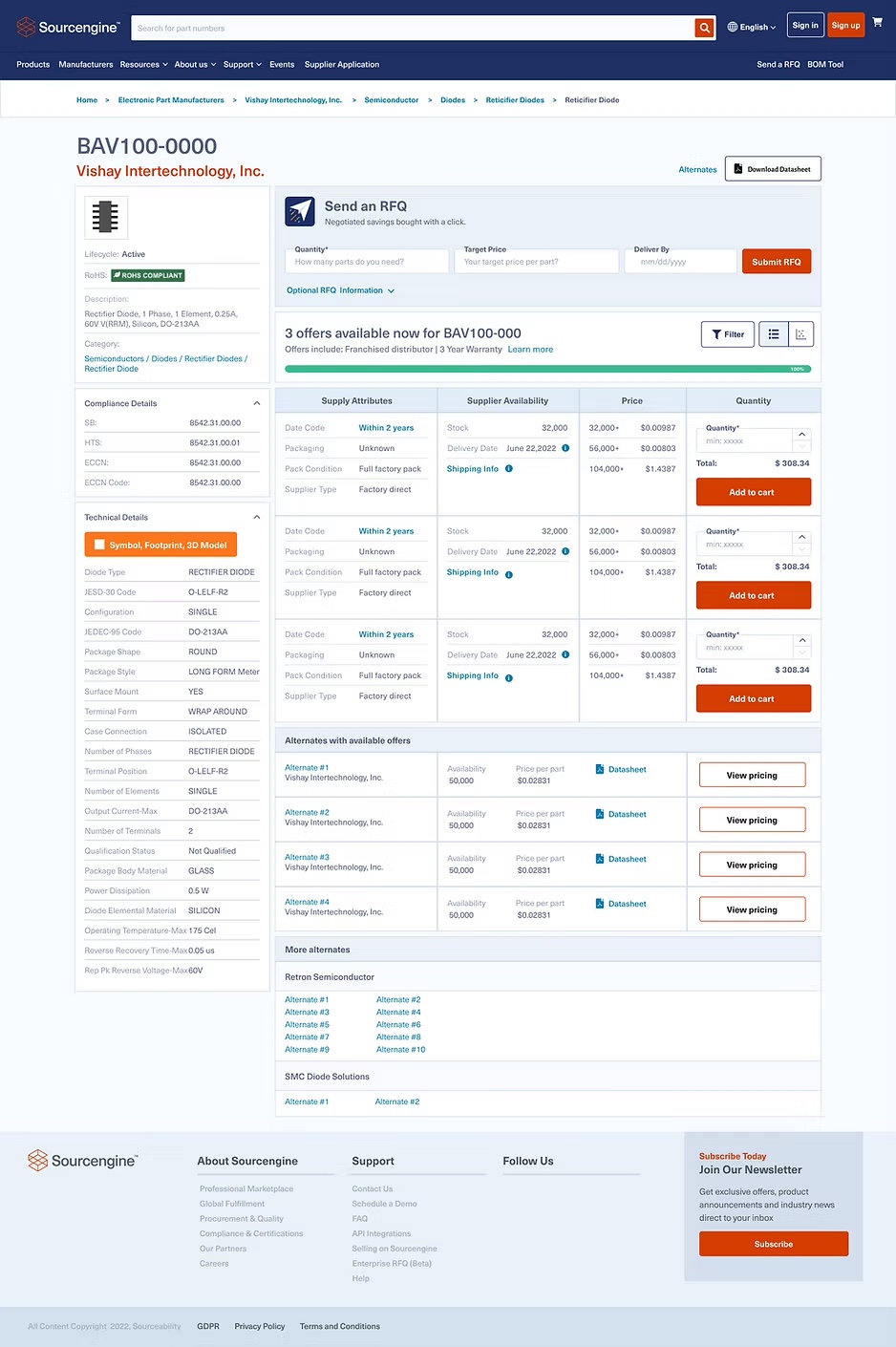
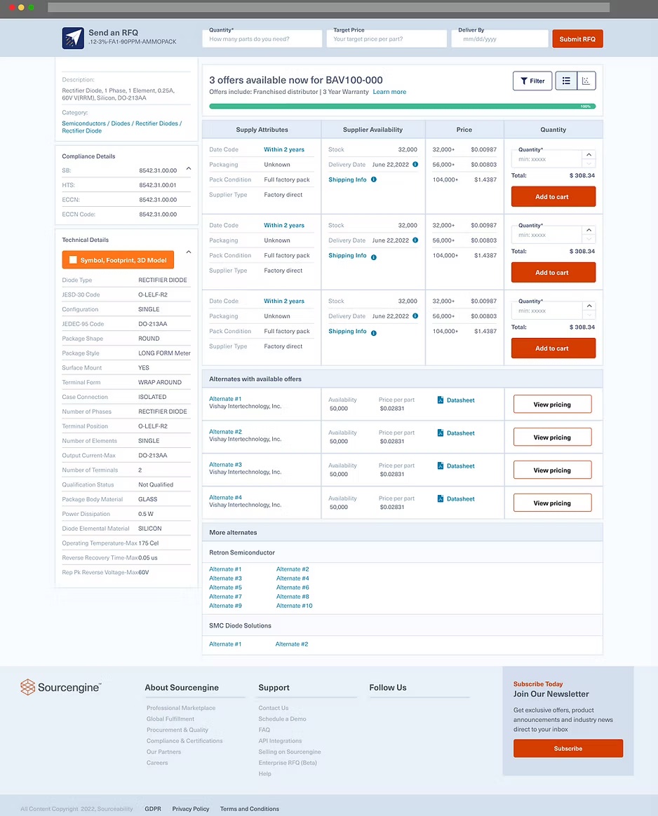
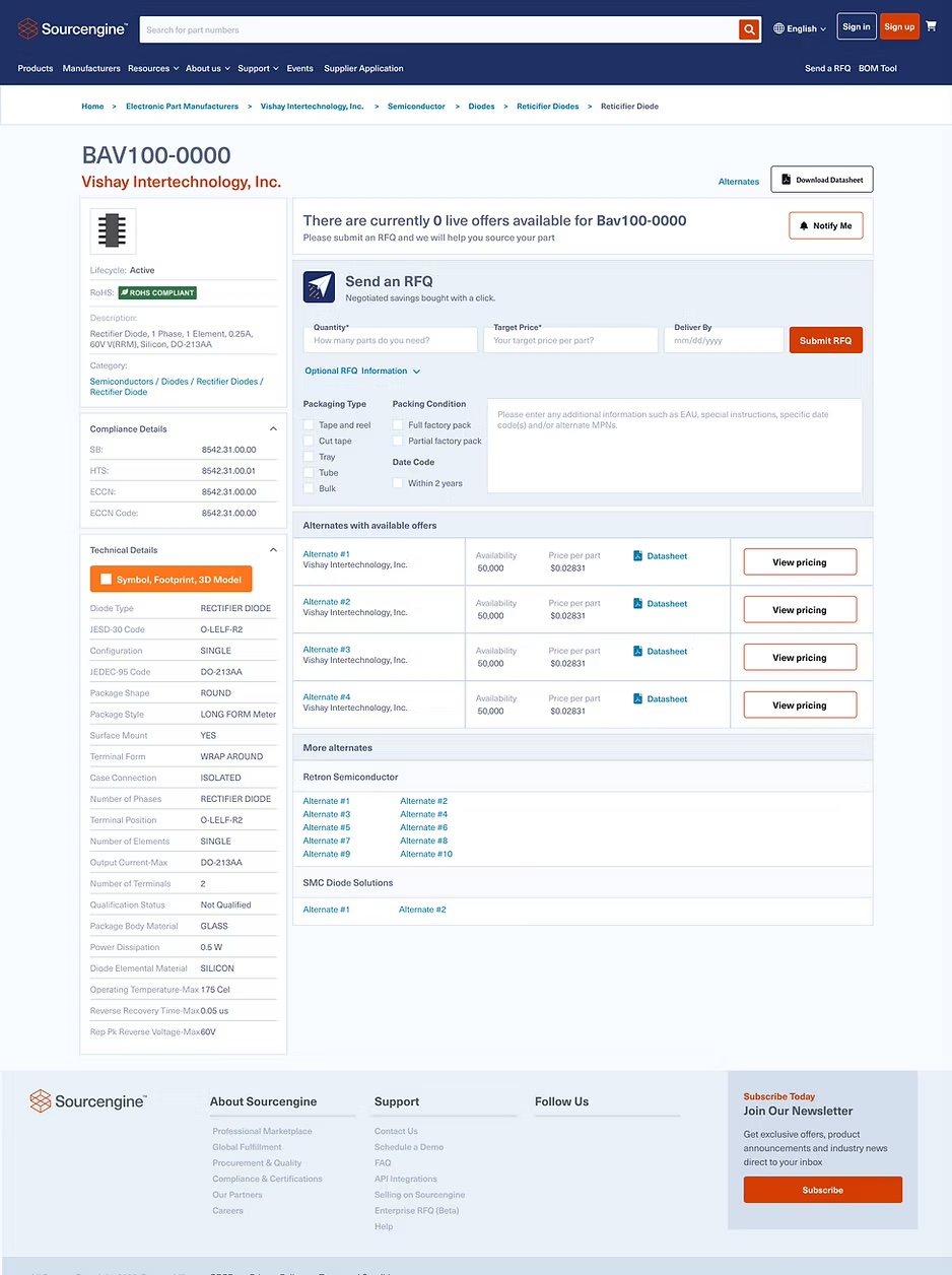
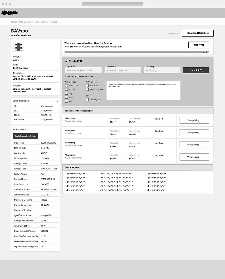
Sourcengine™
PDP Redesign
Redesigned the Sourcengine Product Detail Page to surface pricing and availability above the fold — driving a 50% increase in add-to-cart rates and significantly more RFQ submissions for parts not in stock.