Project Overview
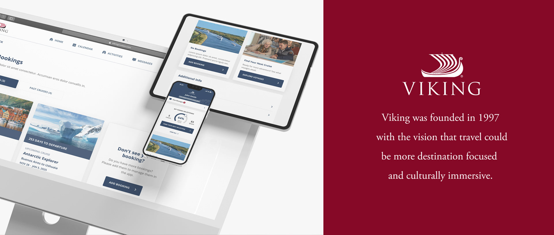
This project aimed to transform Viking’s digital ecosystem by rebuilding the My Viking Journey (MVJ) website and the Viking Voyager App (App) into a unified, seamless digital experience. The goal was to enhance every stage of the guest journey—before, during, and after a cruise—by eliminating functional gaps, addressing usability issues, and meeting the growing expectations for mobile-enabled experiences.
This project aimed to transform Viking’s digital ecosystem by rebuilding the My Viking Journey (MVJ) website and the Viking Voyager App (App) into a unified, seamless digital experience. The goal was to enhance every stage of the guest journey—before, during, and after a cruise—by eliminating functional gaps, addressing usability issues, and meeting the growing expectations for mobile-enabled experiences.
Role: UX Manager & Lead Designer
Collaborating with Product Designers, Digital Product Team & DEV Team
Collaborating with Product Designers, Digital Product Team & DEV Team
Problem
Disjointed User Experience: The existing app and website lack cohesion, creating challenges for users during key phases like booking, in-transit, and post-trip.
Low Adoption and Awareness: Guests depend on call centers and onboard staff due to subpar digital experiences.
Functional Gaps: Limited features and inconsistent performance lead to gaps in user engagement, especially during offline periods.
Goals
Develop a Mobile-First digital companion platform that:
1. Empowers Customers: With tools for itinerary customization, travel updates, and self-service capabilities.
2. Unify the Viking Ecosystem: Create a seamless experience across all phases of the guest journey, including offline functionality.
3. Enhance User Adaptation: Reduce dependency on external support and onboard teams.
4. Data-Driven & Research: : Employ analytics, user surveys and current data to personalize experiences, improve functionality, and drive innovation.
By applying these four principle goals, the Viking customer experience is significantly enhanced, creating a seamless and intuitive journey from start to finish.. Empowering users with itinerary customization, real-time updates, and self-service tools fosters greater control and confidence in their travel planning. A unified Viking ecosystem ensures consistency across all touch-points, including offline functionality, reducing friction and making interactions more fluid. Enhancing user adaptation minimizes reliance on customer support and onboard teams, allowing guests to navigate their experience independently. Finally, leveraging data-driven insights and user research enables continuous optimization, ensuring personalized experiences, improved functionality, and innovative solutions that meet evolving customer needs.
Solution
Consolidated Platform: The new MVJ app merges the website and app into a single digital companion for a unified guest experience.
Expanded Capabilities: Self-service features (e.g., payments, booking add-ons, real-time updates).
Offline Experience: access to cached content during blackout periods.
Digital Concierge: Integration with travel services like navigation, notifications, and bookings.
Improved Adoption: Use of push notifications, personalized content, and seamless logins to ensure greater engagement.
Analytics-Driven Development: Insights into user behavior inform ongoing improvements.
Process
Start with what we understand and the direction we aim to move in
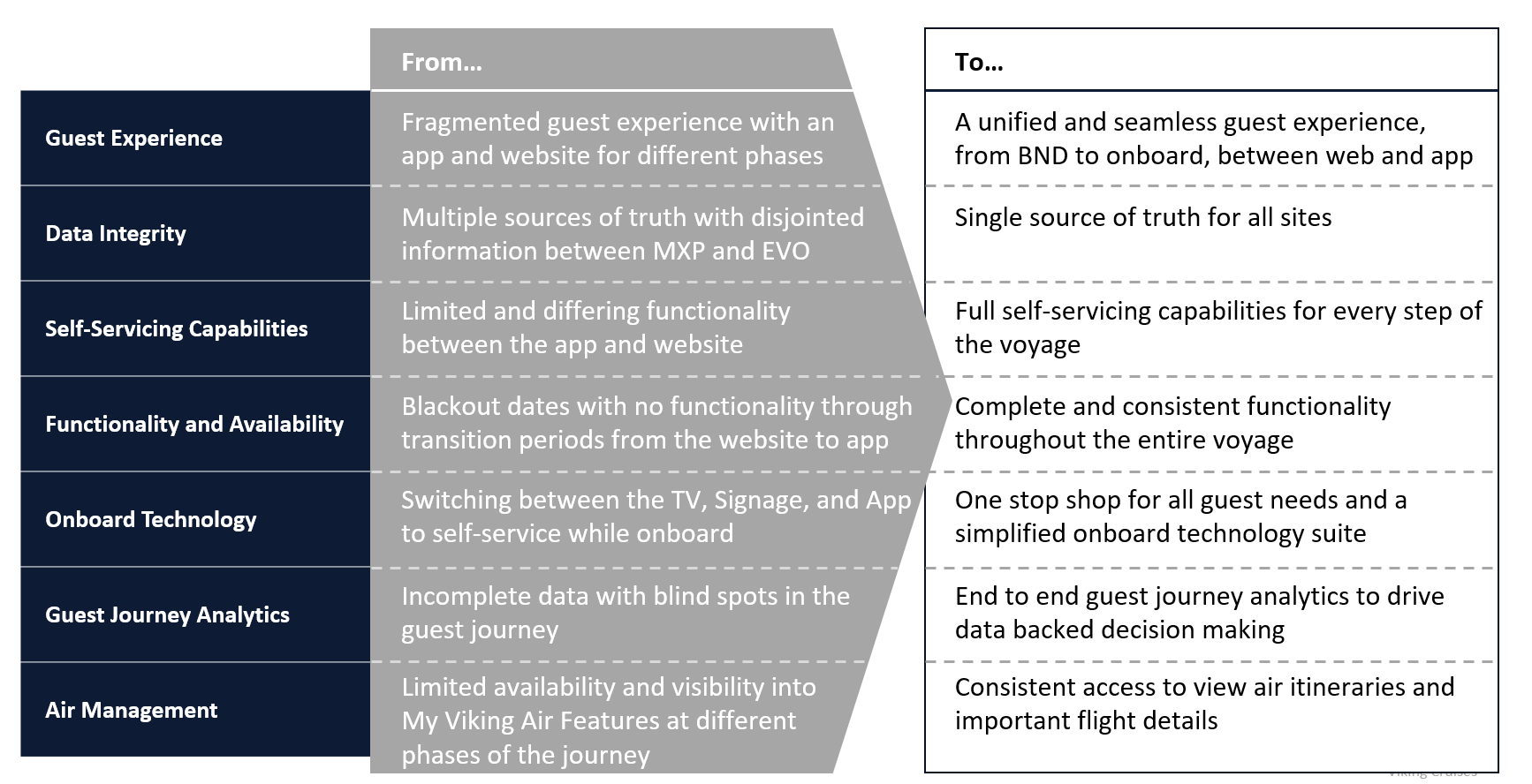
We pinpointed the core pain points and business objectives, aiming to address critical problem areas with targeted solutions. By establishing key performance indicators (KPIs) centered around these challenges, we focused specifically on search categories and category touch-points to guide our efforts moving forward.
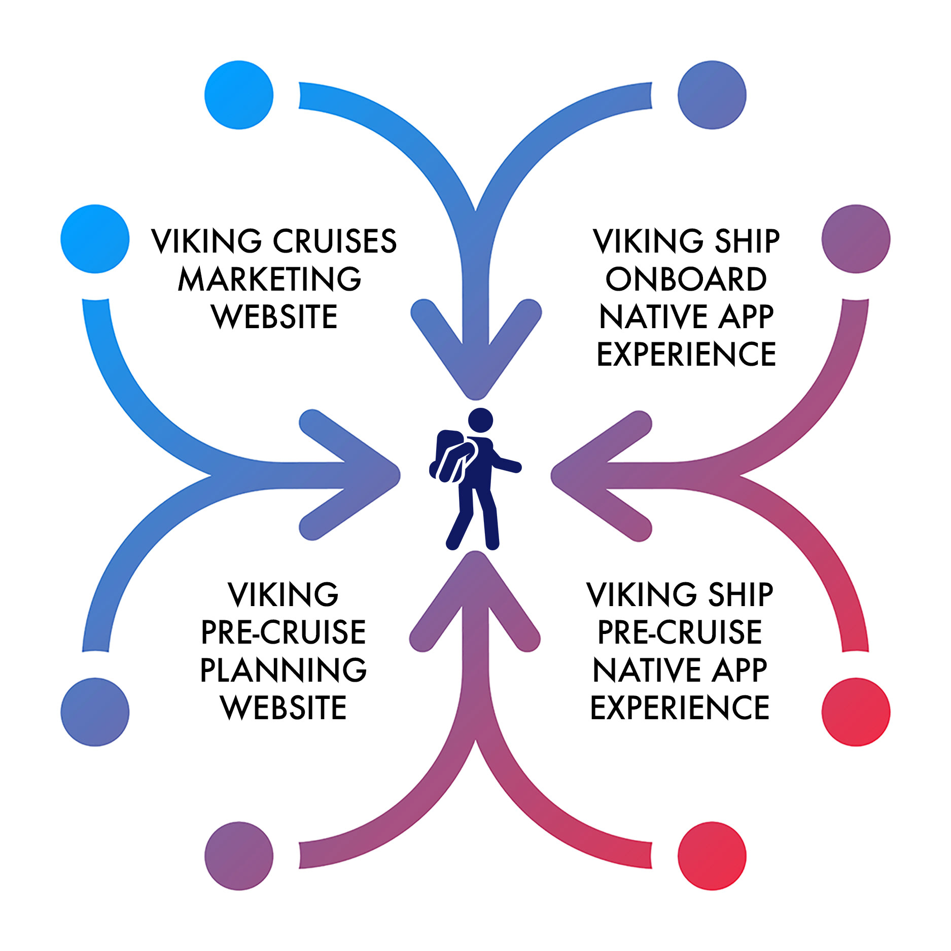
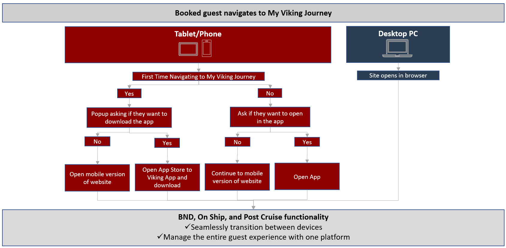
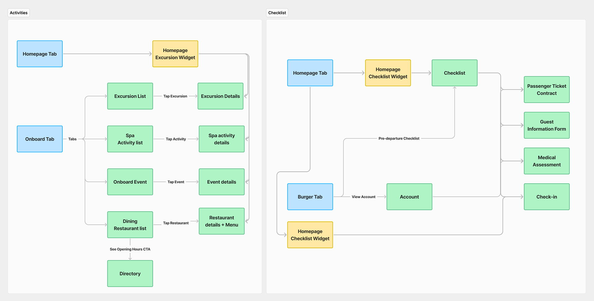
Mapping The Journey
A well-structured sitemap is the foundation of a seamless user experience. By mapping out the site’s hierarchy, we identified opportunities to streamline navigation, reduce friction, and guide users towards key actions effortlessly.
Existing Designs
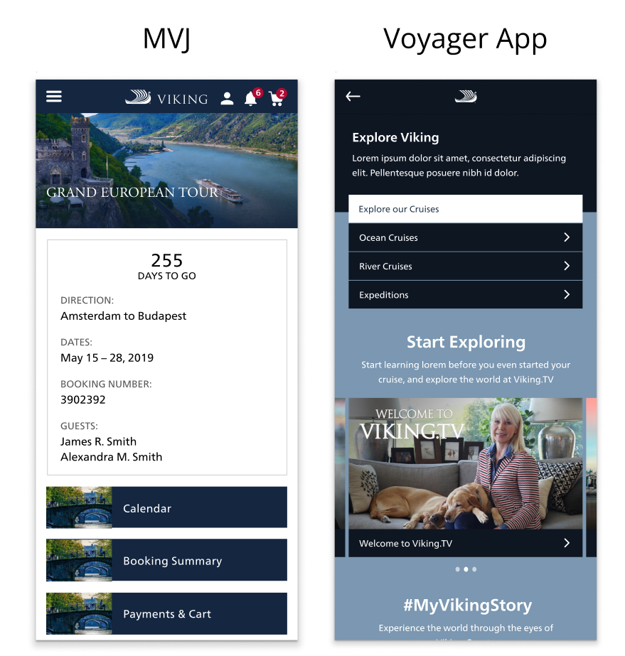
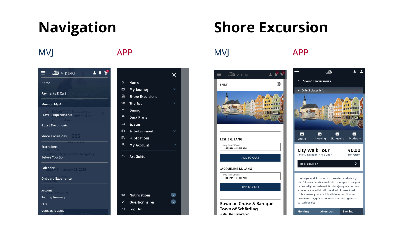
Currently, the App and MVJ operate as two distinct products, although they offer overlapping functionalities. Upon initially booking their cruise, users access MVJ to book excursions, review itineraries, and perform similar tasks. After boarding the ship, they switch to the App, which provides much of the same functionality. This separation leads to challenges in two key areas:
Visual Identity: A comparison of the two experiences reveals a lack of cohesive branding. The two products do not present a unified look and feel, making it difficult for users to perceive them as part of the same brand.
Accessibility: Users can easily log into MVJ via the Viking website. The App requires the user to, well, you know, download the app. Not an ideal experience to juggle the two and impairs the overall user experience.
High-Fidelity Mocks (Part 1)
This project progressed rapidly, and the design agency we collaborated with promptly produced high-fidelity designs. While these designs were aesthetically pleasing and well-developed in terms of user interface, they fell short in achieving our user experience goals. Despite the time constraints, their assistance was invaluable, providing us with an excellent foundational starting point.
This project progressed rapidly, and the design agency we collaborated with promptly produced high-fidelity designs. While these designs were aesthetically pleasing and well-developed in terms of user interface, they fell short in achieving our user experience goals. Despite the time constraints, their assistance was invaluable, providing us with an excellent foundational starting point.
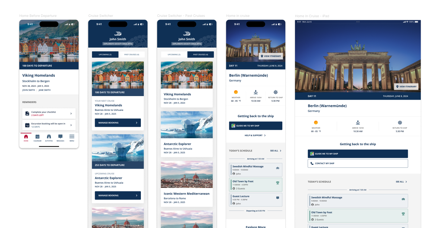
High-Fidelity Mocks (Part 2)
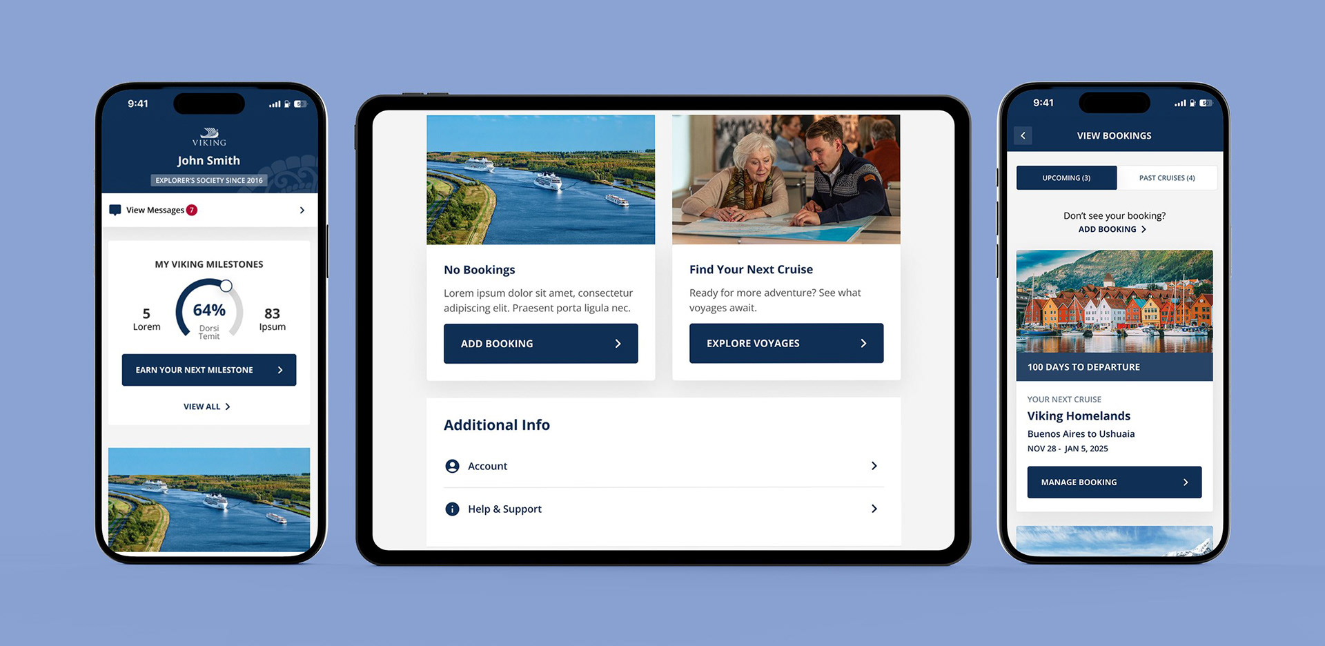
With a clear foundation established, it was essential to deepen our focus on user experience design. While the design agency provided us with a solid starting point, they did not fully develop the comprehensive experience we needed. Key components for the integrated app were still outstanding, including features such as Gamification, Login/Create Account functionality, a dynamic Message Center, a section for booking your next cruise, and much more. These were the elements I was tasked with conceptualizing and designing. The absence of these features would prevent users from experiencing the full potential of MVJ and the App.
With a clear foundation established, it was essential to deepen our focus on user experience design. While the design agency provided us with a solid starting point, they did not fully develop the comprehensive experience we needed. Key components for the integrated app were still outstanding, including features such as Gamification, Login/Create Account functionality, a dynamic Message Center, a section for booking your next cruise, and much more. These were the elements I was tasked with conceptualizing and designing. The absence of these features would prevent users from experiencing the full potential of MVJ and the App.
Validating Success: Testing & Data Insights
Utilizing great user testing & data tools, conducting feedback sessions and intercept surveys helped us shape and mold our initial concepts. Working with past guest user pool and a new-to-cruising user pool, we established behavioral analytics that provided key insights into pain points and opportunities. By applying these findings, we optimized the design to better align with user expectations and needs who were familiar with the current Viking experience and those that were completely new to Viking.
Utilizing great user testing & data tools, conducting feedback sessions and intercept surveys helped us shape and mold our initial concepts. Working with past guest user pool and a new-to-cruising user pool, we established behavioral analytics that provided key insights into pain points and opportunities. By applying these findings, we optimized the design to better align with user expectations and needs who were familiar with the current Viking experience and those that were completely new to Viking.

Average Session Length:
92%
of users engaged more with the newly redesigned app,
indicating improved usability and retention
92%
of users engaged more with the newly redesigned app,
indicating improved usability and retention
App Bounce Rate:
86%
Most users successfully navigated past the first screen,
actively engaging with the app beyond the initial interaction
86%
Most users successfully navigated past the first screen,
actively engaging with the app beyond the initial interaction
Look & Feel:
78%
of users felt that the new app was a vast improvement on
the old App and MVJ experiences.
78%
of users felt that the new app was a vast improvement on
the old App and MVJ experiences.
User Convenience:
99%
of users see the benefit of having MVJ and the App combined
and think a single app (versus a disjointed app and mobile web experience) makes for a better/preferred experience
99%
of users see the benefit of having MVJ and the App combined
and think a single app (versus a disjointed app and mobile web experience) makes for a better/preferred experience